The secret to a realistic monotone finish isn’t adding dirt, but building a visual history through controlled, translucent layers of paint.
- Move beyond 100% opacity; use techniques like black-basing and marbling to create subtle, built-in tonal variation from the start.
- Employ filters to unify and shift color tones across the entire surface, and use washes specifically to define shadows in recesses.
Recommendation: Begin by treating your primer coat not as a foundation, but as the first and most important layer of your model’s visual story.
For the intermediate painter, the flat, uniform finish of a single-color aircraft can be a source of immense frustration. You’ve followed the instructions, applied the correct shade of Olive Drab or Panzer Grey, yet the result looks less like a battle-hardened machine and more like a plastic toy. The common advice is to “add weathering”—a flurry of panel line washes and chipping that often feels disconnected from the surface itself. This approach treats realism as an afterthought, a layer of grime applied on top of a sterile finish.
This method misses the fundamental point. A realistic finish doesn’t just show dirt; it tells a story of light, wear, and environment. The most convincing models achieve this not through superficial effects, but through a deep, complex interplay of color built from the ground up. We must shift our thinking from applying a single coat of paint to orchestrating a symphony of translucent layers, where each pass contributes to the final, rich tapestry of color.
But what if the key wasn’t about hiding the base coat, but about letting it breathe through the subsequent layers? This guide abandons the conventional pursuit of total opacity. Instead, we will explore a more artistic, layered approach. We will delve into how to use base coats as a source of shadow, how to modulate color with filters, create organic fading with unconventional materials, and construct a “finish architecture” with varnishes to transform a flat, monotone scheme into a canvas of subtle, believable complexity.
This article provides a structured path to mastering these techniques. From foundational principles to advanced skills, each section builds upon the last to develop your painter’s eye and elevate your work.
Summary: A Painter’s Guide to Depth on Monotone Schemes
- Translucent layers: why you shouldn’t aim for 100% coverage on every pass?
- Filters vs Washes: what is the difference and when to use a filter?
- How to use coarse salt to create random, organic fading patterns?
- How to prevent water spots when using multiple acrylic layers?
- Matte, Gloss, Satin: in what order to apply varnishes to seal layers?
- How to Spray Soft-Edge Camouflage Freehand Without Splatter?
- Pre-shading vs Black-basing: Which Technique Creates More Realistic Tonal Variation?
- How to Simulate Scale Lighting Effects on Flat Wings?
Translucent layers: why you shouldn’t aim for 100% coverage on every pass?
The pursuit of a perfectly opaque, uniform base coat is the primary obstacle to achieving a realistic finish. Think of your model’s surface not as a wall to be painted, but as a canvas where depth is created by what lies beneath. A single, heavy layer of paint obliterates all potential for subtle tonal shifts, resulting in a flat, lifeless object. The artistic alternative is to build up your color through a series of thin, translucent layers, allowing the underlying tones to influence the final appearance and create chromatic vibration.
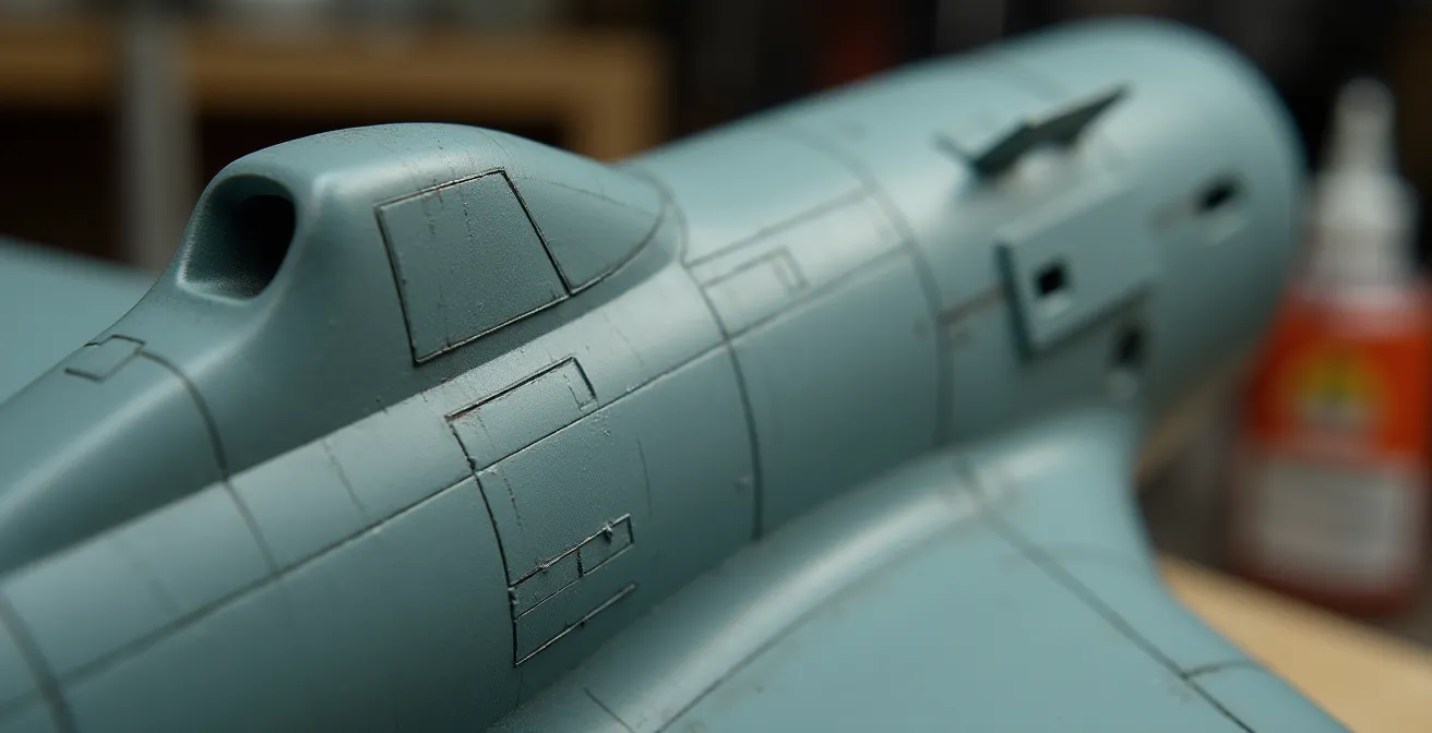
This is the core principle behind advanced techniques like black-basing and marbling. Instead of starting with a uniform grey or white primer, you begin with black. Then, you apply a “marble coat”—a random, scribbled pattern of your base color—over the black. This non-uniform undercoat becomes your shadow and light map. As you apply your main color in thin, misty layers, you intentionally avoid 100% coverage. You let the marbled pattern show through, creating an organic and complex variation that feels integrated into the paint itself. This technique of starting with a black base and building up with thin blending coats creates a wonderful and subtle ‘marbling’ effect.

As the illustration shows, this approach allows you to create a visual map of light and shadow before the main color is even applied. The center of panels can be made lighter by applying more of the marble coat, while panel edges and shadow areas remain darker. Each subsequent translucent layer of the main color enriches this effect rather than erasing it. It’s a fundamental shift from covering a surface to building its visual history, layer by whisper-thin layer.
Filters vs Washes: what is the difference and when to use a filter?
Once your complex base coat is established, the next stage of refinement involves two distinct tools: filters and washes. While often confused by beginners, they serve fundamentally different purposes in creating a model’s visual history. A wash is a detail-oriented tool used for creating shadows, while a filter is a broad, atmospheric tool used to subtly modify and unify the entire surface. A wash creates separation; a filter creates cohesion.
A wash is a very thin, dark paint (like a dirty thinner) applied precisely into recesses, panel lines, and around raised details. It flows via capillary action and, once dry, simulates the accumulation of grime and shadow, making details pop. It’s a targeted application. A filter, by contrast, is an extremely diluted, almost transparent layer of color applied with a wide brush over the entire model or large sections. Its goal is not to settle in recesses but to cast a subtle chromatic tint over everything it touches. For example, a very light blue filter can impart a cool, high-altitude feel, while a pale ochre filter can suggest a fine layer of dust, harmonizing the underlying camouflage colors and weathering effects.
The key difference lies in both intent and paint-to-thinner ratio. A wash is about creating contrast, while a filter is about adjusting tone. Understanding when to use each is crucial for a sophisticated finish.
This comparative table clarifies the distinct roles and application methods for these two essential techniques. As the data from modeling experts shows, the physical properties and intended effects are fundamentally different.
| Aspect | Filter | Wash |
|---|---|---|
| Paint Ratio | 1:20 (paint to thinner) | 1:10 (paint to thinner) |
| Coverage | Entire surface | Panel lines and recesses only |
| Primary Purpose | Unify colors and shift tone | Create shadows and separation |
| Application Method | Large brush, even coating | Fine brush, capillary action |
| Visual Effect | Subtle overall color modification | Pronounced detail enhancement |
Stacking multiple, different-colored filters (with adequate drying time between each) can create an incredibly rich and complex finish. A layer of violet over olive drab, for instance, can produce a beautiful, subtle desaturation that is far more realistic than a flatly-applied color.
How to use coarse salt to create random, organic fading patterns?
To move beyond uniform fading and create the kind of random, chipped, and worn patterns seen on real-world vehicles, artists can turn to an unconventional material: coarse salt. The salt weathering technique is a masterful way to introduce controlled chaos into your finish. It acts as a liquid masking fluid that produces hard-edged, organic shapes, perfectly simulating areas where paint has been scoured away by use and environment.
The process is beautifully simple. First, you apply your “chipping” color—often a dark brown for primer or a metallic shade for bare metal. Once dry, you moisten the surface with water and sprinkle on coarse salt. The salt adheres to the wet surface, forming a random mask. You then spray your main camouflage color over the salt. After the paint has fully dried, you gently scrub the salt away with a stiff brush and water, revealing the “chipped” layer underneath in a perfectly random pattern. For even more depth, this process can be layered, creating multi-toned wear patterns.
Case Study: Salt Technique for Dust Pattern Creation
Beyond paint chipping, modelers have adapted the salt technique to create textured grime. Instead of paint, they apply the wet salt mask and then dust the area with weathering pigments. The pigments are then fixed with a pigment binder. When the salt is removed, it leaves a permanent, textured pattern of grime that is distinct from what can be achieved with traditional paint or washes, adding a tangible layer of realism to tracks and lower hull areas.
The choice of salt grain size is critical and directly impacts the scale of the effect. According to scale calculations from modeling experts, fine table salt (0.3mm) can create scratches that equate to 14.4mm at 1:48 scale, which is often too small and busy. In contrast, coarse sea salt (2-3mm) represents much larger 96-144mm damage patches, which are more visually appropriate for simulating significant wear and tear on panels.
How to prevent water spots when using multiple acrylic layers?
As you build your model’s visual history with numerous translucent acrylic layers, filters, and washes, you introduce a significant risk: water spots and “tide marks.” These unsightly blemishes occur when water, used for thinning paint or cleaning brushes, pools and evaporates unevenly. As it dries from the outside in, it pushes pigment particles to the edge of the puddle, leaving a distinct, dark ring that can ruin a carefully blended finish. Preventing them is a matter of controlling your materials and drying process.
The single most effective preventative measure is to eliminate the source of the problem: the minerals in your water. Tap water is full of dissolved minerals that get left behind upon evaporation, creating white, chalky spots. Professional modelers consistently recommend using distilled water, which reduces tide mark formation by 95% compared to tap water. This simple switch is a non-negotiable for serious acrylic painters. Secondly, avoid letting water pool. If you’re cleaning a wash or applying a heavily thinned layer, use a second, clean brush that is merely damp to wick away any excess liquid before it can sit on the surface.
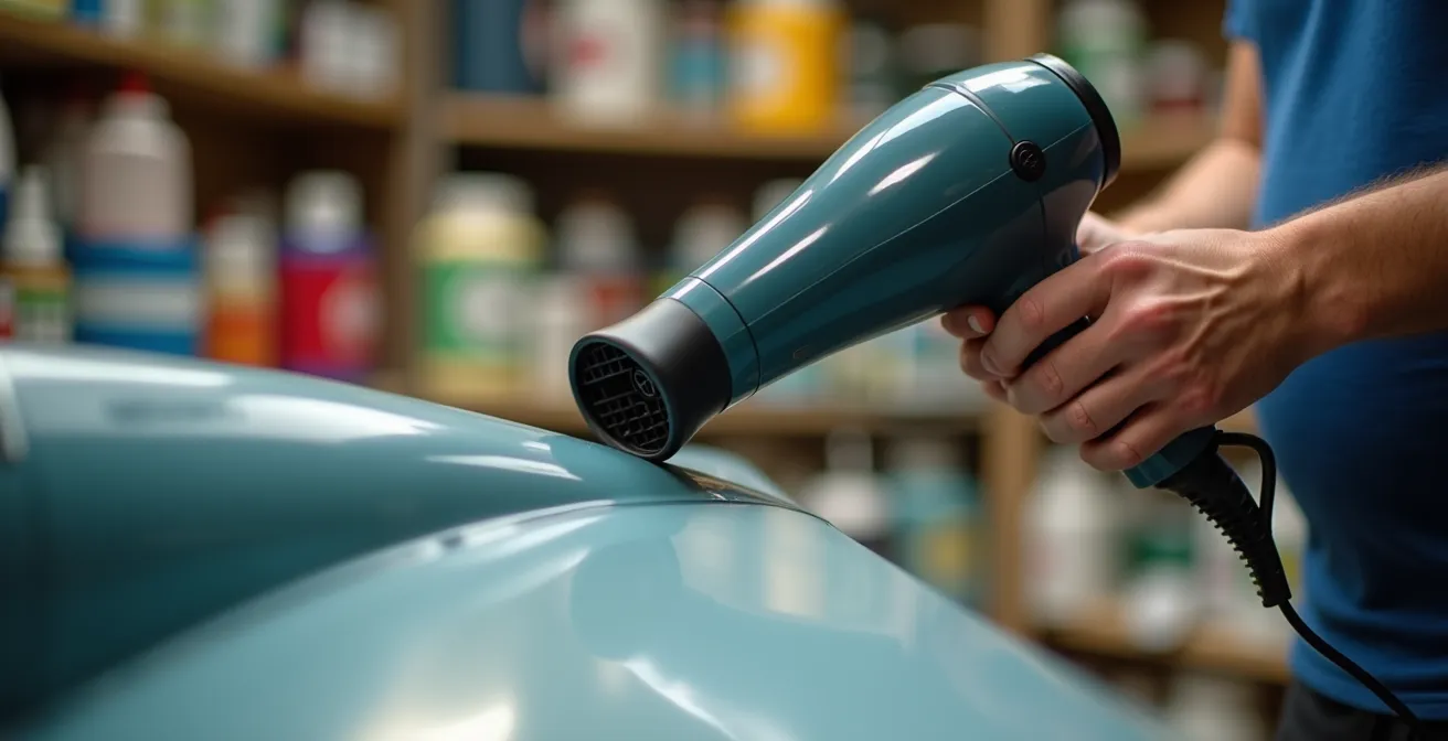
Finally, take control of the drying process. Don’t just let the surface air dry passively. Using a hairdryer on a low-heat, low-power setting, held at a safe distance of 8-10 inches, encourages fast and even evaporation. This active drying technique, as demonstrated, prevents water from having the time to pool and form tide marks. It keeps the pigment evenly distributed and preserves the delicate transitions you’ve worked so hard to create.
Action Plan: Emergency Water Spot Fix
- Identify the Blemish: Determine if the spot is a white mineral deposit or a dark pigment tide mark.
- Reactivate Gently: Dampen a clean brush with the appropriate acrylic thinner (not water).
- Work the Edges: Gently work from the outside edge of the spot inward using small, circular motions to feather out the pigment.
- Level the Surface: For stubborn spots, apply a very thin coat of gloss varnish over the area. This can level the surface and make the spot disappear.
- Mist and Blend: If necessary, reapply the base color as a highly-thinned, almost invisible mist coat to unify the area with its surroundings.
Matte, Gloss, Satin: in what order to apply varnishes to seal layers?
The final stage in building your model’s visual history is the application of clear varnishes. This is far more than just a protective step; it is the finish architecture that defines the material properties of your model and locks in the depth you have created. The choice and sequence of varnishes—gloss, satin, and matte—are critical artistic decisions that control how light reflects off the surface, telling the final chapter of your model’s story. Applying them in the wrong order can undo hours of work.
The standard professional workflow is often called the “Satin Sandwich.” It begins after the base colors and camouflage are complete. First, a uniform gloss coat is applied. This creates a hard, smooth surface that is absolutely essential for the next steps: applying decals and pin washes. Decals will “silver” (trap air) on a matte surface, and washes will bleed uncontrollably. The gloss coat prevents both. After decals and washes are sealed and dry, the key unifying coat is applied: satin varnish. A pure matte finish is often too flat and toy-like for a scale vehicle body, while gloss is too shiny. Satin provides a subtle, realistic sheen that accurately represents painted metal. Most of the final weathering, like oil streaks and chipping, is done on top of this satin layer.
Only at the very end are selective matte and gloss varnishes used for final adjustments. An ultra-matte varnish can be airbrushed onto areas of heavy dust accumulation, like lower hulls and wheels, while a touch of gloss can be applied to simulate wet fuel spills or fresh oil leaks. This planned sequence ensures each weathering step performs optimally and the final finish has a varied, believable texture.
The final sheen should never be uniform across an entire model. Different materials reflect light differently, and using a variety of finishes is a key component of realism. This table offers a guide for selecting the appropriate finish for different surfaces.
| Surface Type | Recommended Finish | Scale Realism Factor |
|---|---|---|
| Main vehicle body | Satin | Most realistic for painted metal |
| Rubber tires/tracks | Flat matte | Eliminates unrealistic shine |
| Glass/canopies | High gloss | Maximum transparency |
| Dust accumulation areas | Ultra-matte | Simulates powder coating |
| Wet/oil stained areas | Gloss | Suggests liquid presence |
How to Spray Soft-Edge Camouflage Freehand Without Splatter?
For many camouflage schemes, particularly those of the Luftwaffe or modern jets, achieving a soft, feathered edge between colors is paramount. While masking with putty can work, true mastery comes from spraying these patterns freehand with an airbrush. The beginner’s nightmare here is the dreaded “spidering” or splatter, where the paint suddenly shoots out in an uncontrolled web. Avoiding this comes down to a delicate balance of three critical levers: paint viscosity, air pressure, and trigger discipline.
First, your paint must be thinned correctly. For fine-line work, the ideal consistency is that of skim milk. A common starting point is a 3:1 ratio of thinner to paint, but this varies by brand. The paint must be thin enough to atomize at low pressure without drying on the airbrush needle. Second, your air pressure (PSI) must be low. High pressure forces too much paint out too quickly, leading to splatters. For soft-edge freehand work, a pressure between 10-15 PSI provides maximum control and minimizes overspray. At this pressure, you must work closer to the model, typically 2-3 inches from the surface, to maintain a tight spray pattern.
Case Study: The Dagger Stroke Method in Practice
The final piece of the puzzle is trigger control, often called the “dagger stroke.” It is a fundamental muscle memory for airbrush users. You must always start the airflow first by pressing down on the trigger. Only then do you gently pull back to release paint, all while your hand is in motion. To stop, you push the trigger forward to cease the paint flow *before* you stop your hand’s movement and release the upward pressure to cut the air. Professional modelers report that mastering this “air on, paint on, paint off, air off” sequence eliminates the vast majority of splatter issues, as splatters are most often caused by a sudden blast of paint hitting a stationary surface.
Consistent, steady hand movement is the final ingredient. Moving too slowly allows paint to pool, while moving too quickly results in a faint, dusty line. Practice on scrap plastic or an old model until the combination of distance, speed, and trigger control becomes second nature. It’s a skill that, once learned, opens up a new world of painting possibilities.
Pre-shading vs Black-basing: Which Technique Creates More Realistic Tonal Variation?
For decades, pre-shading was the standard technique for adding depth to model finishes. The method involves spraying black or dark grey paint along panel lines and in shadow areas before the main color is applied. The idea is that these dark lines will subtly show through the final top coat, creating an impression of shadow. While effective, pre-shading often results in a very linear, geometric, and predictable pattern. The shadows are exactly where you drew them, which can sometimes look more like a technical drawing than an organically weathered surface.
In recent years, many advanced modelers have shifted to black-basing for a more realistic and varied result. As discussed earlier, this technique starts with an all-over black primer coat. A marble coat of a lighter color (like a deck tan or light grey) is then applied in a random, mottled pattern, focusing more on the center of panels. The final camouflage color is then built up in translucent layers, allowing this chaotic underpainting to create the tonal variation. The first rule is simple: use a black base. You don’t have to worry about getting enough coverage to hide the primer; if you don’t put the paint down as thick, instead of obvious primer peeking through, you get shading.
The key difference is the nature of the variation. Pre-shading creates defined, linear shadows. Black-basing creates broad, soft, and random areas of light and dark across the entire surface. This effect is less about highlighting panel lines and more about simulating how light and shadow, combined with faint wear and fading, would affect a large metal surface. It produces a finish with more “vibration” and less uniformity. Moreover, it is often more efficient. In a comparative test on identical model parts, it was shown that black-basing can provide 40% more tonal variation than traditional pre-shading while requiring 25% less paint for full coverage.
How to Simulate Scale Lighting Effects on Flat Wings?
One of the most advanced concepts in realistic modeling is “scale lighting” or “color modulation.” The principle is that light does not fall evenly on a real-world object. Horizontal surfaces receive more light and appear brighter, while vertical and undersurfaces are in shadow and appear darker. Because a scale model is so small, it doesn’t interact with light in the same way as its full-sized counterpart. Therefore, the artist must paint these light effects directly onto the model to trick the viewer’s eye. This is especially important on large, flat surfaces like aircraft wings.
A powerful technique to achieve this is Zenithal Priming (from the “zenith,” the point directly overhead). You start by priming the entire wing assembly in solid black. Then, with the wing positioned horizontally, you spray a light grey or white primer from directly above (a 90-degree angle). This automatically makes the upper surfaces lighter and leaves the undersides and vertical elements in shadow, creating a perfect map for your scale lighting. The translucent base color is then applied over this pre-shaded foundation, allowing the light-and-shadow map to show through.
To enhance this effect further, you can apply a “desaturation mix”—your base color lightened with about 10% light grey—in a very thin layer exclusively to the uppermost surfaces and the center of panels. This pushes the “top-down lighting” effect even further. According to artistic depth perception research, this kind of forced perspective is incredibly powerful; for instance, simply reducing contrast by 30% from the wing root to the wing tip can increase the perceived scale of the object by up to 50% in the viewer’s mind. By painting in the light, you are not just coloring a model; you are manipulating perception to create a more convincing illusion of scale and mass.
Key takeaways
- Abandon the goal of 100% opacity; use translucent layers over a marbled or black base to create built-in depth and tonal variation.
- Use filters to unify and subtly shift color tones across the whole model, and use washes specifically to create sharp shadows in panel lines.
- Employ a “Satin Sandwich” varnish sequence (Gloss -> Decals/Washes -> Satin -> Weathering -> Final Adjustments) for a realistic finish.
- For organic realism and tonal richness, black-basing consistently outperforms the more linear and predictable results of traditional pre-shading.