The key to transforming a flat, monochromatic model into a convincing 3D object lies not in the colors you use, but in how you manipulate light and shadow through advanced paint application.
- True realism comes from understanding pigment behavior, moving beyond generic white to use buff and off-whites that offer warmth and opacity without chalkiness.
- Mastering a range of masking materials allows for “controlled demarcation,” creating a sophisticated interplay of soft and hard-edged highlights across different panels.
- The final illusion is achieved with a harmonizing filter, a highly thinned layer of the base color that unifies disparate highlights into a cohesive, believable whole.
Recommendation: Shift your mindset from “coloring panels” to “sculpting with light,” and begin by analyzing how light interacts with real-world aircraft to inform your highlighting choices.
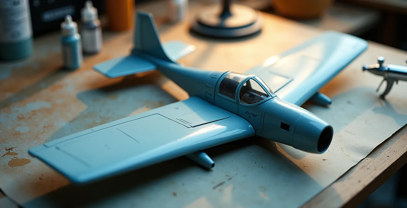
For the advanced painter, there is no greater challenge, nor a more satisfying achievement, than transforming a single-color aircraft model into an object of convincing weight and dimension. You have mastered the clean build, the seamless joins, and the crisp panel lines. Yet, the final result can still feel frustratingly flat, a plastic shell rather than a machine of metal and stress. The surface sits inert, lacking the subtle shifts in light and tone that trick the eye into perceiving form and volume. This is a common plateau for many talented modelers, a sign that the next level of artistry is within reach.
The conventional wisdom of the hobby often points towards mechanical techniques like harsh pre-shading or uniform panel highlighting. While these methods have their place, they frequently lead to predictable and stylized outcomes—checkerboard wings and stark, toy-like lines that scream “model.” The true path to a three-dimensional illusion lies in a more sophisticated approach, one that treats the model’s surface not as a coloring book, but as a canvas for sculpting with light. This requires moving beyond simply making things “lighter” or “darker.”
The secret is to think like an illusionist. It’s about understanding the subtle physics of light and the specific properties of your pigments. What if the key to avoiding a chalky finish wasn’t in the technique, but in the very particle size of your white pigment? What if the difference between a quilt-like mess and a harmonious surface was a nearly transparent filter of paint? This is the core of our exploration: we will move beyond the “what” and into the “why” of advanced lighting effects.
This guide will deconstruct the art of the volumetric illusion. We will explore how to establish a logical light source, choose the right pigments to avoid common pitfalls, master varied masking techniques for dynamic panel work, and, most importantly, learn how to unify it all into a subtle and convincing whole. Prepare to treat your airbrush less like a spray can and more like a sculptor’s chisel.
In this article, we delve into the sophisticated techniques required to turn flat surfaces into dynamic, three-dimensional forms. The following sections provide a structured journey from the foundational theory of light to the practical application of blending, weathering, and finishing.
Summary: Sculpting with Light: A Painter’s Guide to Scale Illusion
- Top-down lighting: why the upper fuselage should be lighter than the sides?
- How to lighten base colors with buff instead of white to avoid chalkiness?
- Post-it notes vs Tape: techniques for highlighting individual panels
- How to blend modulated panels so the plane doesn’t look like a quilt?
- How to highlight dark blue or black planes without making them look grey?
- How to Build Visual Depth on Monotone Camouflage Schemes?
- How to Prevent Decal Silvering on Matte Paint Surfaces?
- Jet Age vs Propellers: Which Era Offers the Best Learning Curve for Weathering?
Top-down lighting: why the upper fuselage should be lighter than the sides?
The fundamental principle behind creating a three-dimensional illusion on a model is establishing a single, consistent light source. For aircraft, the most logical and natural source is the sun, positioned overhead. This concept, known as zenithal lighting, dictates that the uppermost surfaces of the aircraft—the top of the fuselage, the upper wing roots, and the horizontal stabilizers—receive the most intense light and should therefore be the lightest in color. Conversely, the vertical sides and underbelly receive progressively less light and should be rendered in darker tones. This simple gradient is the foundation of the entire volumetric illusion, tricking the viewer’s brain into perceiving curves and mass where there is only a miniature plastic surface.
Simply spraying a lighter color from above is a start, but for an advanced painter, the goal is to move beyond the mechanical zenithal method towards what is known as volumetric highlighting. While zenithal lighting is a global effect, volumetric highlighting is more selective and artist-driven. It focuses on emphasizing the shape and form of individual components as they would naturally reflect light. As an artist, you can choose to enhance the light on a specific curve or volume to draw attention and create a more dynamic, less uniform effect. An in-depth article on advanced techniques explains that volumetric highlighting emphasizes the true three-dimensional shape of an object, allowing you to paint reflections as they would naturally be seen.
This approach requires observation and artistic license. You are no longer just a technician applying paint; you are an interpreter of light. Ask yourself: where would a secondary bounce of light from the ground illuminate a small portion of the underwing? How does a curved fuselage transition from its brightest point on top to its darkest point below? It’s a dance between a primary overhead light source and the subtle, imagined reflections that give a model life. The upper surfaces are lighter not just because they are “on top,” but because you, the artist, have decided that this is the primary plane for capturing and reflecting your imaginary sun.
By internalizing this “light-first” mindset, every subsequent painting step becomes a logical extension of this initial decision, rather than an isolated technique.
How to lighten base colors with buff instead of white to avoid chalkiness?
One of the most common frustrations in creating highlights is the dreaded “chalky” or “pastel” finish that results from mixing pure white into a base color. This happens because standard titanium white pigments are engineered for maximum opacity and brightness, but their fine particle size can scatter light in a way that desaturates the hue, creating a powdery, lifeless appearance. This is a tell-tale sign of a model, and it instantly shatters the illusion of scale. To achieve a rich, warm, and sun-bleached highlight rather than a faded pastel one, the solution lies in changing the pigment itself. The secret weapon for advanced painters is Titanium Buff or similar off-white colors.
The magic of buff lies in its pigment behavior. It’s an unbleached titanium dioxide, which gives it a naturally warmer, creamier tone. More importantly, its particle structure is different. In-depth analysis of pigment particle measurements show that buff titanium can have a particle size of around 1µm, compared to the 0.4µm of regular titanium white. This larger particle size provides excellent opacity without the light-scattering effect that causes chalkiness. When mixed with a base color like olive drab or medium blue, it lightens the value while preserving the hue’s richness, resulting in a color that looks authentically sun-faded, not artificially lightened.
To understand the difference, a visual comparison is essential. The image below shows the textural distinction at a microscopic level, highlighting the smooth, creamy nature of buff compared to the granular texture of standard white.
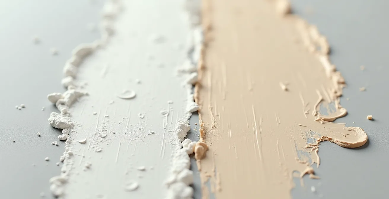
As you can see, the buff pigment integrates more smoothly, creating a finish that feels more like a part of the original color. When applying this, start by mixing a small amount of buff (perhaps 10-15%) into your base color for the initial highlights. You can progressively increase the ratio for the brightest points, but you will find that far less is needed to achieve a noticeable yet natural effect. Other excellent alternatives include very light greys like Corax White or warm off-whites like Pallid Wych Flesh, which serve the same purpose of lightening without desaturating.
By abandoning pure white in favor of these more sophisticated alternatives, you gain precise control over the warmth and saturation of your highlights, a key step towards a truly professional finish.
Post-it notes vs Tape: techniques for highlighting individual panels
Once you’ve established your overall zenithal lighting, the next stage of the illusion is to create subtle variations between individual panels. This is where many modelers create the “quilt” effect by uniformly highlighting the center of every panel. A more sophisticated approach involves selective highlighting and the use of different masking materials to achieve varied edge effects. This practice of controlled demarcation is about making conscious choices between the hard, crisp lines of tape and the soft, feathered edges offered by other materials. The goal isn’t just to mask a line, but to control how the light appears to fall across a surface break.
Traditional masking tapes like Tamiya tape are invaluable for creating sharp, precise lines, perfect for canopy framing or distinct camouflage patterns. However, for panel modulation, their very sharpness can be a drawback, creating an unnatural, overly defined highlight. This is where “loose masks” come into play. A simple Post-it note is one of the most versatile tools in this context. Its low-tack adhesive allows it to be placed and moved easily, and by holding it slightly off the surface while spraying, you can create a soft, slightly diffused edge that looks far more natural than a hard-taped line. A detailed guide on advanced masking techniques beyond traditional tape highlights the utility of such ‘loose masks’ for localized work. This method is perfect for creating a subtle shift in tone on a larger panel without creating a stark border.
To help you choose the right tool for the job, the following table compares the properties of common “soft” and “hard” masking materials. This will allow you to plan your panel work with intention, mixing different edge qualities across the model for a more dynamic and less uniform finish.
| Material | Edge Quality | Residue Risk | Best Use Case |
|---|---|---|---|
| Blu-Tack | Soft/feathered | None with original brand | Wrap-around schemes, soft demarcation |
| Silly Putty | Very soft | Can stick to PE parts | Complex shapes, quick application |
| Post-it Notes | Medium-hard | Minimal | Moveable masks, panel work |
| Tamiya Tape | Hard/crisp | None if de-tacked | Precise lines, curves |
By combining these materials, you can create a far more sophisticated surface. Use Tamiya tape for a freshly replaced panel that would have a hard edge, but use a Post-it note or Silly Putty for general panel highlights where a softer, more integrated look is desired. This is the essence of controlled demarcation: choosing your edge based on the story you want to tell.
Ultimately, this considered approach to masking elevates the process from a simple technical step to an integral part of the artistic illusion.
How to blend modulated panels so the plane doesn’t look like a quilt?
You have meticulously highlighted individual panels, varying the intensity and edge softness. The result is visually interesting up close, but from a distance, the model can look like a patchwork quilt—a collection of distinct squares rather than a cohesive whole. This is the critical juncture where many advanced techniques fall apart. The solution is the final, unifying step: the harmonizing filter. This is an extremely thin, translucent layer of the original base color, misted over the entire model to tie all the disparate highlights together. It doesn’t erase your hard work; it softens and integrates it, making the tonal variations appear to be part of the same painted surface.
The technique is subtle but powerful. As one expert from MODEL AIRPLANE MAKER notes in their article on paint marbling, the common criticism of such techniques can be overcome. They state:
The knock on pre-shading is usually related to uniform ‘lines’ on the model. But those can be toned down with a few more passes of the main colour, tinted clear coats and even other distressing techniques like filters.
– MODEL AIRPLANE MAKER, Paint Marbling Technique Article
This same principle applies perfectly to blending post-shaded panels. The harmonizing filter acts as that “tinted clear coat,” reducing the contrast just enough to create a believable finish. The hands in the image below are holding two wing sections that perfectly illustrate the goal: moving from the harsh, high-contrast effect on the left to the subtle, unified surface on the right, where panel variations are present but not jarring.

Applying this filter requires a delicate touch. The key is a very high thinner-to-paint ratio, typically around 90-95% thinner to 5-10% paint. This creates a transparent mist, not an opaque coat. You should build it up slowly in several light passes from a moderate distance (6-8 inches), allowing you to visually judge the effect in real-time. The goal is to knock back the contrast, not eliminate it. This unifying coat is the final act of light sculpting, ensuring your masterpiece looks like a weathered aircraft, not a collection of painted squares.
Action Plan: The Unifying Filter Technique
- Complete all panel modulation and highlighting, then allow the paint to fully cure for 24 hours.
- Create the filter by mixing your original base color at a ratio of approximately 95% thinner to 5% paint.
- Apply the filter in very thin, misting coats from a distance of 6-8 inches (15-20cm) to avoid any pooling or runs.
- Assess the effect between passes. Use the “Step Back and Squint” test: view the model from 3 feet away to judge the overall harmony and contrast.
- Use your phone’s camera in black and white mode to objectively check that tonal variations are still present but are now more subtle and integrated.
This final harmonizing step is what separates a good paint job from a truly masterful one, creating a finish that is complex, visually deep, and utterly convincing.
How to highlight dark blue or black planes without making them look grey?
Highlighting extremely dark colors like gloss sea blue or night-fighter black presents a unique challenge. The instinctive approach of adding white or even buff can quickly turn a deep, rich black into a chalky, washed-out grey. The illusion of a black aircraft is shattered, replaced by something that looks faded and unrealistic. The key to successfully adding dimension to these dark schemes is to think in terms of tonal shifts and saturation, not just value (lightness/darkness). Instead of asking “How do I make this lighter?”, ask “What color would this be if it were a slightly faded black or a sun-bleached dark blue?”
The answer is almost never grey. For a black aircraft, your highlighting color should be a very dark grey, a hint of dark brown, or even a touch of dark blue mixed into the black. For example, adding a small amount of a color like Tamiya NATO Black or a dark tire rubber color to your primary black will raise the value just enough to be perceptible without losing the “blackness.” This creates highlights that read as subtle variations in the material rather than a different color altogether. This technique is especially effective for creating the illusion of volume on the upper surfaces, which would catch the most light but would still appear black to the observer.
For dark blues, like those found on mid-century naval aircraft, the same principle applies. Instead of adding white or buff, which can create a pastel “baby blue,” try adding a lighter, but still saturated, blue to the base. A touch of intermediate blue or even a light sky grey can be used to lighten the base color while maintaining its chromatic intensity. The goal is to create a sun-bleached effect, not a faded one. You can apply these lighter mixes to the center of panels and uppermost surfaces, then blend them with a harmonizing filter made from the thinned original dark blue to unify the effect.
By focusing on subtle, in-hue tonal shifts, you maintain the aircraft’s powerful dark presence while simultaneously sculpting its form with light, achieving the best of both worlds.
How to Build Visual Depth on Monotone Camouflage Schemes?
Monotone schemes, such as the overall Olive Drab of a P-47 Thunderbolt or the uniform grey of a modern F-16, are the ultimate test of a painter’s ability to create visual interest. With no camouflage pattern to break up the surface, the model’s form must be conveyed entirely through light and texture. A poorly executed monotone scheme looks exactly like what it is: a single-colored piece of plastic. A masterfully executed one, however, is a canvas of subtle tonal shifts, highlights, and shadows that create a powerful sense of scale and realism. All the techniques we’ve discussed—zenithal lighting, volumetric highlighting, panel modulation, and harmonizing filters—are not just applicable here; they are absolutely essential.
The process begins with establishing the foundational volumetric illusion. A strong zenithal undercoat (black or dark brown from below, light buff or grey from above) is non-negotiable. This provides the initial gradient of light and shadow upon which everything else is built. When the thin base coat of olive drab or grey is applied over this, the underlying tones will subtly influence the final color, creating an immediate sense of form. From there, the work of panel modulation begins. Using your base color lightened with buff, you can selectively lighten the center of panels, focusing more intensity on the upper surfaces and less on the sides, reinforcing the overhead light source.
The key to making a monotone scheme pop is variation. Don’t lighten every panel equally. Pick a few panels on the wings or fuselage and make them slightly lighter or even subtly darker (by adding a touch of black or dark brown to the base color) to represent replacements or touch-ups. Use different masking methods—a Post-it for a soft edge on one panel, tape for a hard edge on another. After this meticulous work, the harmonizing filter becomes your most important tool. It’s the step that pulls all these subtle, disparate effects together, ensuring the aircraft looks like a single, cohesive machine that has been weathered by the elements, rather than a collection of differently colored squares.
On a monotone aircraft, you have nowhere to hide. Every brushstroke and every puff of the airbrush contributes to the final illusion, making it a true exercise in the art of light sculpting.
How to Prevent Decal Silvering on Matte Paint Surfaces?
There are few things more disheartening in model painting than applying a perfectly placed decal, only to have it dry with a milky, silvery sheen around its edges. This phenomenon, known as “silvering,” completely shatters the painted-on illusion and screams “sticker.” The cause is not a faulty decal but a physical mismatch between the decal and the surface. A matte paint finish, when viewed under a microscope, is not smooth; it’s a rough, porous surface with microscopic peaks and valleys. When a decal is applied over this, tiny pockets of air get trapped between the decal film and the paint surface. It is the reflection of light off these trapped air pockets that creates the silvery effect.
The solution is to eliminate the air pockets, and the only way to do that is to create a perfectly smooth surface for the decal to adhere to. This is achieved by applying a gloss clear coat over the entire model (or at least the areas where decals will be placed) *before* decaling. The gloss varnish flows into all the microscopic pores of the matte paint, creating a glass-smooth surface. When the decal is applied to this surface with a setting solution, there is no air to get trapped. The decal can snuggle down and make complete contact with the surface, resulting in a painted-on look with no silvering.
The proper workflow is a multi-step process that ensures a perfect result every time:
- First Gloss Coat: After all your painting, modulation, and blending is complete and fully cured, apply one or two light, even coats of an acrylic gloss varnish (like Tamiya X-22 or an Aqua Gloss). Let this cure completely.
- Decal Application: Apply your decals as normal, using decal setting solutions (like Micro Set and Micro Sol) to help them conform to surface details and adhere strongly.
- Second Gloss Coat: Once the decals are dry, apply another light gloss coat over them. This step is crucial as it “seals” the decal and ensures that its sheen matches the rest of the surface, hiding the decal film edges.
- Final Varnish: Finally, apply your desired final finish. Whether it’s matte, satin, or semi-gloss, this last varnish coat will unify the entire model, including the decals, under a single, consistent sheen, completing the illusion.
It may seem like extra work, but taking the time to prepare the surface with a gloss coat is the professional’s secret to making decals disappear into the paintwork.
Key Takeaways
- Think Light, Not Just Color: The foundation of all realism is establishing a consistent light source. The color choices and highlights should all serve to reinforce this single volumetric illusion.
- Pigment Science is Practical: Choosing buff or off-white over pure white to lighten colors is not just an aesthetic choice; it’s a technical one based on pigment particle size that prevents chalkiness and preserves color richness.
- Harmony Through Blending: A model with varied panel highlights is just a collection of squares until a final, translucent harmonizing filter is applied to unify the entire surface into a cohesive and believable whole.
Jet Age vs Propellers: Which Era Offers the Best Learning Curve for Weathering?
For the advanced painter looking to push their skills, the choice of subject matter can significantly influence the learning experience, especially concerning weathering. Both propeller-driven aircraft, particularly from the World War II era, and modern jets offer unique canvases, but they teach very different lessons. For developing a broad and versatile skill set, propeller aircraft arguably offer the best learning curve. Their operational environment and mechanical nature produced a wide and organic variety of weathering effects that provide a forgiving yet challenging playground for the artist.
A WWII fighter was a machine of oil, exhaust, mud, and chipping paint. Piston engines leaked and spattered oil across the fuselage and wings. Exhaust stacks left rich, dark stains. Operations from grass or dirt strips meant mud and dust were kicked up onto the undercarriage and wing roots. The paint itself was often applied hastily and would chip and wear dramatically. This provides a fantastic opportunity to practice a huge range of techniques: oil dot filters, streaking effects, pigment application for dust and mud, and complex multi-layer chipping. The effects are often dramatic and allow for more artistic freedom. A slightly overdone oil stain on a P-51 looks plausible; the same effect on a pristine F-22 Raptor would look absurd.
In contrast, the Jet Age is a study in subtlety and precision. Weathering on modern jets is typically more restrained and specific. It consists of faint fluid leaks from hydraulic systems, subtle panel line washes, soft heat staining on bare metal engine sections, and the very specific patterns of grime that accumulate on low-maintenance grey schemes. The challenge here is one of control. A single errant streak can ruin the clean lines of a modern aircraft. Weathering a jet teaches restraint, precision with the airbrush, and the art of building up barely-there layers of grime. It’s less about broad, organic effects and more about crisp, technical detail.
For the painter wanting to master the full orchestra of weathering, starting with the rich, varied canvas of a propeller aircraft is the ideal path. Once those skills are honed, they can be refined and applied with the necessary subtlety and precision required to bring a modern jet to life.